Survey Reminder Email Sample: Boost Survey Responses
Your survey went out. A few people replied quickly, a few clicked and disappeared, and most did nothing. That’s the part that frustrates teams. You already did the hard work of writing the survey, choosing the audience, and setting up tracking in Gmail or Outlook. Still, the first send rarely captures everyone who meant to respond.
A good reminder fixes that, but not by blasting the same message again. Reminder emails work when they reduce friction, change the angle, and arrive at the right moment. Survey reminder emails can increase response rates by as much as 36% according to Mailtani, which is why one send almost never gives you the full picture.
Below are 7 practical survey reminder email sample formats that fit real inbox workflows. Each one is designed for busy operators using Gmail or Outlook, with concrete ways to draft faster, personalize better, and keep follow-up manageable inside the tools you already use.
Table of Contents
- 1. The Simple One-Click Reminder
- 2. The Value-Driven Personalized Reminder
- 3. The Multi-Touch Sequential Reminder Series
- 4. The Incentive-Based Reminder with Urgency Messaging
- 5. The Video-Embedded Interactive Reminder
- 6. The Role-Based Conditional Content Reminder
- 7. The Lightweight Micro-Survey Reminder with Inline Completion
- 7 Survey Reminder Email Samples Comparison
- Key Takeaways for Higher Survey Responses
1. The Simple One-Click Reminder
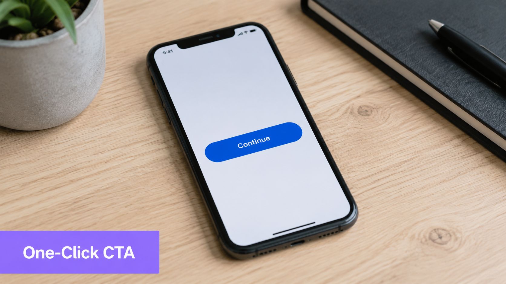
A survey reminder often fails for a simple reason. The recipient opens it between meetings, sees a wall of text, and decides to deal with it later. Later usually means never.
For executives, account owners, and customers who work straight from their inbox, I use the shortest version possible. The format is simple: one sentence of context, one button, and one deadline.
This works well for SurveyMonkey reminders, Typeform follow-ups, and Qualtrics surveys because the email feels complete at a glance. In Gmail on mobile and Outlook on desktop, that matters. If the CTA shows up in the preview pane without scrolling, the message has a much better chance of getting handled on the spot.
Keep it visible in the preview pane
Button copy does real work here. “Start survey” is stronger than “Click here” because it tells the reader exactly what happens next. If your team sends these reminders in volume, an AI email assistant for Gmail and Outlook can draft the reminder, personalize the opener, and keep the tone consistent without forcing you into stiff templates. Pair that with a basic email automation workflow for follow-ups and reminders so the message goes out on time inside the tools your team already uses.
A working sample:
Hi Sarah, just a quick reminder to share your feedback before Friday. It should only take a few minutes.
[Start Survey]
This format holds up because it respects the inbox.
A few execution details make the difference:
- Keep the CTA high: Place the button above the fold so it appears quickly in Gmail and Outlook preview layouts.
- Use a clear deadline: “Before Friday” gives enough urgency without sounding forced.
- Cut everything extra: Skip the apology, backstory, and secondary links. Every extra choice lowers the chance of completion.
- Draft for the reading environment: Outlook can make long emails feel heavier, and Gmail mobile rewards messages that get to the point fast.
I also avoid writing these one by one if the audience is large. In Gmail and Outlook, Ellie can generate the reminder from the original survey email, pull in the recipient name, and keep the phrasing short enough to fit the preview pane. That saves time, but the bigger win is consistency. Every reminder stays clear, direct, and easy to act on.
Busy people do not need clever copy. They need a visible button and a reason to click it now.
2. The Value-Driven Personalized Reminder

Some reminders need more than a nudge. If you’re asking for product feedback, onboarding feedback, or customer success input, the recipient needs to know why their response matters. This is the survey reminder email sample I use when a generic “just checking in” would feel lazy.
Slack, Notion, and HubSpot-style feedback programs often succeed because the message ties the survey to a visible outcome. Recipients are more likely to respond when they can see the decision on the other side of the form.
Tie the ask to a real outcome
A strong version sounds like this:
Hi Daniel, I’m following up because your feedback helps us prioritize improvements for the rollout your team is using now. We’re reviewing responses this week, and your input would directly shape what we change next.
[Share Your Feedback]
That second sentence does the heavy lifting. It explains why this survey exists now, not in some vague future.
Use AI email personalization inside your workflow to draft different openers for a support lead, a finance stakeholder, or an admin user without rewriting every reminder by hand. In Outlook, categories make this manageable. In Gmail, labels and saved audience filters do the same job.
Practical rule: Never say “your feedback matters” unless you can finish the sentence with how it will be used.
A few details make this version better:
- Reference role or context: Mention the team, rollout, renewal window, or recent support interaction when it’s relevant.
- Show a concrete consequence: Explain whether feedback informs roadmap decisions, service changes, or account planning.
- Keep the time ask honest: If it’s short, say so. If it isn’t, don’t pretend otherwise.
What doesn’t work is fake personalization. First-name merge tags alone don’t create relevance. Context does.
3. The Multi-Touch Sequential Reminder Series
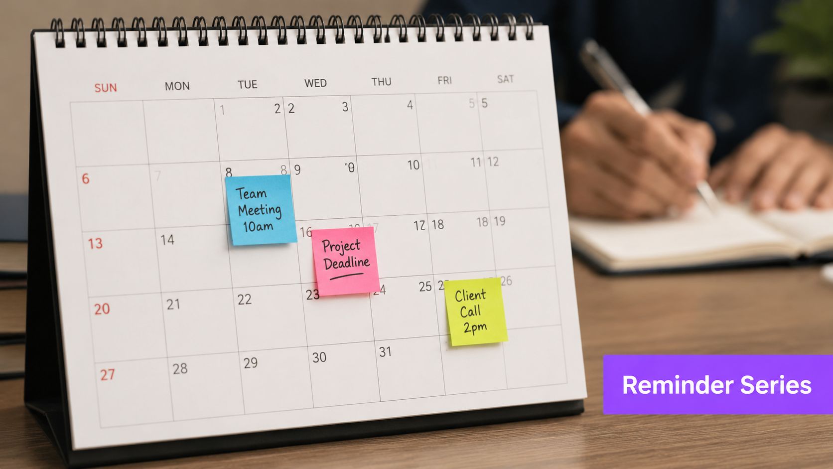
A single reminder works for low-stakes surveys. A sequence works better when responses affect a launch review, customer success planning, or post-event decisions and part of the list will miss the first email.
The key is message progression. Three reminders with recycled copy train people to ignore the thread. Three reminders with different jobs can recover a meaningful share of responses without making the campaign feel lazy.
Build each touch to do a different job
Use a simple three-step sequence:
- Email one: Set the context. Explain why the survey is open and who is reviewing the responses.
- Email two: Reduce effort. Resend the direct link, restate the time to complete, and remove any extra copy that slows the click.
- Email three: Set a real deadline. Give a clear closing point and make the final ask concise.
A sample flow looks like this:
Reminder 1: Hi Sam, we’re collecting feedback on your onboarding experience and reviewing responses with the implementation team this Friday. If you can spare 3 minutes, please share your input here.
[Take the Survey]
Reminder 2: Hi Sam, sending your survey link again in case it got buried. It should take about 3 minutes, and your response still makes it into this week’s review.
[Complete the Survey]
Reminder 3: Hi Sam, last call before we close responses tomorrow at 5 PM. If you want your feedback included in this review cycle, please send it here.
[Submit Feedback]
This format holds up well in production because each send answers a different objection. The first explains why. The second makes it easier. The third gives the recipient a reason to act now.
Execution matters as much as copy. In Gmail, thread stacking can hide repeated CTAs, so I often keep the second reminder in-thread and send the final one with a fresh subject if the survey is important enough. In Outlook, conversation view creates the same problem. Categories, delayed send, and quick steps help keep the sequence organized without manual follow-up work.
If you use email automation for reminder sequences inside Gmail or Outlook, draft all three emails at once, then adjust the tone and timing before they go out. An AI assistant like Ellie is useful here because it can rewrite each touch for the same sender voice, pull in account context, and suppress follow-ups once someone has completed the survey.
A few practical rules keep this from turning into noise:
- Change the angle each time: context, convenience, then deadline.
- Set suppression rules: anyone who already responded should stop receiving reminders immediately.
- Watch the thread experience: if the CTA is buried, change the subject line on the final send.
- Keep timing realistic: two or three touches is usually enough for one survey cycle.
If you want to include a short walkthrough or product clip in the middle touch, these tips for making short-form product videos are useful for keeping it brief enough to support the survey ask instead of distracting from it.
Change the reason to respond in each reminder. Repeating the same ask with a new subject line is still repetition.
What fails here is over-automation. If every recipient gets the same three emails on the same cadence, regardless of role, account value, or prior engagement, fatigue shows up fast. The sequence should feel planned, not mass-produced.
4. The Incentive-Based Reminder with Urgency Messaging
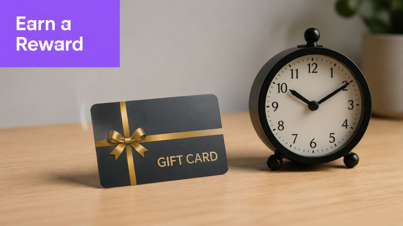
A common scenario. The first reminder got opened, maybe even clicked, but the survey still sits unfinished. In that case, a small incentive plus a clear deadline can move the response from “later” to “done today.”
This format works best when the audience already knows your brand and the survey has a real business purpose. Customer support teams, ecommerce brands, and CX programs use it to raise completion rates without building a long nurture sequence. The trade-off is quality control. A weak incentive attracts fast, low-effort responses, while a well-framed one gives busy recipients a fair reason to prioritize the ask.
Urgency works when it stays concrete
A solid sample:
Hi Maya, we’re closing this survey on Friday at 5 p.m., and responses submitted before then are eligible for a $10 gift card. We’re using this feedback to improve support wait times and follow-up quality.
[Complete the Survey]
The email needs three things. A real cutoff, a plain explanation of who gets the reward, and one click to the survey. If any of those pieces are vague, replies slow down because recipients have to stop and interpret the offer.
In Gmail, I usually keep the subject line blunt: “Survey closes Friday. $10 gift card for completed responses.” In Outlook, a slightly more formal version tends to fit better with corporate inboxes: “Reminder: feedback survey closes Friday, incentive included for completed responses.” That small channel adjustment matters because the same copy does not read the same way in every inbox.
A few practical rules keep this type of reminder credible:
- Spell out eligibility: say whether every completed response qualifies or whether it is a drawing.
- Use a specific deadline: include the day, and include the time if the window is short.
- Keep the reward secondary: the survey purpose should still be clear in the first two lines.
- Send from a recognizable person or team: incentives from an unfamiliar sender can look like phishing.
- Check rendering in both clients: buttons, spacing, and image fallbacks often behave differently in Gmail and Outlook.
If you want to dress up the reminder with a short explainer clip before the CTA, these tips for making short-form product videos help keep the asset short enough to support the survey instead of competing with it.
I automate this carefully. Inside Gmail or Outlook, an AI assistant like Ellie can draft the urgency version, insert the deadline, personalize the incentive language by segment, and prepare variants for customers, prospects, or support users without forcing the team into a separate sending workflow. That saves time, but the rule stays the same. Only send the incentive reminder to people who have not completed the survey, and stop the follow-up the moment a response comes in.
The failure mode here is easy to spot. If the email reads like a promotion first and a research request second, trust drops fast. Keep the copy specific, calm, and easy to verify.
5. The Video-Embedded Interactive Reminder
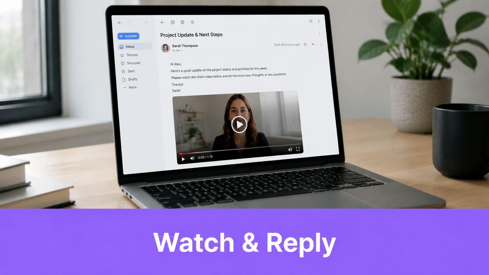
A short video can rescue a reminder that would otherwise look like every other campaign in the inbox. This format works best when the survey topic needs a human face. Product launches, customer research panels, and service-change feedback are good examples.
Intercom, Calendly, and Grammarly-style campaigns use short clips to explain why the response matters before asking for the click. That’s especially useful when the sender is a real person, such as a customer success manager or product lead.
Design for fallback first
In practice, I build this one as if the video won’t load. Outlook is picky, and Gmail clients vary. So the email needs a thumbnail image, alt text, a visible play cue, and body copy that still makes sense without motion.
If you’re working on the creative side of this format, these tips for making short-form product videos are useful for keeping the asset tight enough for email.
A workable sample:
Hi Leah, I recorded a quick video on why we’re running this survey and what we’ll change with the results. If you’d rather skip the video, the survey link is right below and only takes a few minutes.
[Watch the 30-second overview]
[Take the Survey]
Short video helps only when the ask is still obvious without it.
What works here:
- Use a static fallback image: Outlook users should still understand the message immediately.
- Add captions: Many people watch muted, especially on mobile.
- Keep surrounding copy plain: The email should still convert if the recipient ignores the video entirely.
What doesn’t work is embedding a flashy asset that steals attention from the actual survey link.
6. The Role-Based Conditional Content Reminder
If your recipients do different jobs, they shouldn’t get the same reminder. A sales manager, support lead, and system admin read the same survey through different lenses. Sending one universal version usually flattens the value proposition too much.
This format shows up in platforms like Salesforce, Okta, and Atlassian where the product touches multiple departments. Role-based messaging lets you keep one campaign structure while changing the core argument.
Segment before you write
A simple setup might look like this:
- Sales leaders: Emphasize pipeline visibility, handoff quality, or account support.
- Support teams: Emphasize case resolution, workflow friction, or tool reliability.
- Admins or IT owners: Emphasize setup control, permissions, or governance issues.
In Outlook, distribution lists and categories make role testing easier. In Gmail, labels, filters, and separate recipient groups do the same job if you keep naming conventions clean. Ellie is useful here because it can draft each variant in the right tone while pulling current context from connected systems instead of relying on stale spreadsheet fields.
A sample for an admin user:
Hi Priya, we’re gathering feedback from workspace admins on setup, permissions, and day-to-day management. Your response helps us prioritize improvements that affect your team directly.
[Share Admin Feedback]
What works is narrowing the message until the recipient recognizes themselves in it. What doesn’t work is over-segmentation. If you create too many branches, approvals drag, QA gets messy, and somebody will receive the wrong version.
Field note: Three or four role variants are usually easier to maintain than a deeply branched campaign with edge-case logic everywhere.
7. The Lightweight Micro-Survey Reminder with Inline Completion
This is the fastest survey reminder email sample to deploy and the easiest one for recipients to finish. Instead of asking someone to open a form, you ask one question they can answer immediately. That makes it ideal for internal pulse checks, quick satisfaction prompts, and post-meeting feedback.
Slack-style pulse surveys, Google-style feedback nudges, and Apple-like satisfaction checks use this format because it cuts the click barrier. For busy teams, that matters more than elegant survey design.
Ask for the smallest possible action
A micro-survey reminder can be as simple as:
Hi Tom, quick check after this week’s rollout. Was setup easy for your team?
Yes / No
If the buttons don’t display in your email client, use this survey link.
For Gmail and modern clients, lightweight interactive elements can work well when tested carefully. In older Outlook environments, voting buttons are often the safer option. Keep the body to a few sentences and make the fallback link obvious.
There’s also a practical timing wrinkle here. For short-deadline or high-urgency campaigns, Contentsnare notes a lack of strong data-backed guidance in standard templates, even though it discusses newer research indicating that compressed reminder cadences can outperform the usual spread-out approach in some high-urgency B2B cases for survey reminders under tight deadlines. If you’re chasing feedback fast, this is one of the few formats that can justify a tighter send rhythm because the ask is so small.
What works is limiting the question to a binary answer or a very short scale. What doesn’t work is cramming a full survey into the inbox. Once the question needs explanation, send people to a landing page instead.
7 Survey Reminder Email Samples Comparison
| Template | Implementation 🔄 | Resources ⚡ | Expected outcomes 📊⭐ | Ideal use cases | Key advantages 💡⭐ |
|---|---|---|---|---|---|
| The Simple One-Click Reminder | Low complexity, single CTA, preview-pane optimized; fast to set up | Minimal, basic design and testing time | High click-through; moderate completion depth | Executive teams, time-sensitive rounds, high-volume sends | Simplicity reduces friction; fast to personalize |
| The Value-Driven Personalized Reminder | Moderate, personalization tokens and tone matching required | Moderate, CRM access, segmentation, copycraft time | Higher completion and higher-quality responses | Customer success, product feedback, stakeholder surveys | Builds rapport; motivates thoughtful responses |
| The Multi-Touch Sequential Reminder Series | Moderate–high, scheduling, variant drafting, sequence logic | Higher, automation platform, tracking and testing resources | Significant lift (often 2–3x); improved data quality via repeat exposure | Large-scale campaigns, critical feedback rounds, A/B testing | Increases reach over time; supports message optimization |
| The Incentive-Based Reminder with Urgency Messaging | Moderate, incentive mechanics, countdowns, compliance checks | High, incentive budget, fulfillment, legal review | Large response lift (40–70%); risk of lower-quality respondents | High-volume consumer research, urgent feedback needs | Tangible exchange drives participation; easy ROI measurement |
| The Video-Embedded Interactive Reminder | High, video production, embed/fallback design, extensive testing | High, production, hosting, client-render testing | Higher engagement and memorability; better for complex topics | Product launches, brand-building surveys, visual topics | Stands out in inboxes; conveys nuance visually |
| The Role-Based Conditional Content Reminder | High, conditional logic, many variants, rigorous QA | High, clean CRM data, automation support, maintenance | Highest relevance across segments; improved completion by role | Enterprise B2B, multi-product companies, segmented audiences | Delivers tailored messaging at scale; increases relevance |
| The Lightweight Micro-Survey Reminder with Inline Completion | Low–moderate, quick-reply or AMP elements, simple UX | Low, minimal design; may need AMP or client-specific setup | Extremely high response rates for 1–2 Qs (50–80%+); lower depth | NPS pulses, quick decisions, executive-level checks | Minimal friction; near-instant responses from recipients |
Key Takeaways for Higher Survey Responses
The common failure point is easy to spot. A team sends the same reminder to everyone, sends it too late, and then wonders why response quality drops after the first push. Higher survey response rates usually come from cleaner execution inside the inbox tools people already use.
A workable cadence is simple. Send the survey on Day 0. Follow up with a light reminder on Day 2 or 3. If the survey matters to the recipient, send a more specific value-focused reminder a few days later. Finish with a clear final notice around Day 7 if the deadline is real. Keep the list clean as replies come in, and stop reminders as soon as someone completes the survey.
Gmail and Outlook shape how these reminders perform. Gmail mobile cuts weak openings fast, so the first two lines have to carry the ask. Outlook still needs extra attention for buttons, spacing, and image rendering. Threading also changes behavior. In some cases, keeping the reminder in the same conversation helps with recognition. In other cases, a fresh subject line gets more visibility, especially for executives with crowded inboxes.
The operational checklist is straightforward:
- Segment before sending: Split non-openers, clickers who did not finish, and priority accounts that need a specific note.
- Use the right reminder format: One-click and micro-survey reminders reduce friction. Personalized or role-based reminders work better when the feedback has higher business value.
- Automate draft creation inside the inbox: Ellie can draft follow-ups in Gmail and Outlook, pull in context from past threads, and save reps from rebuilding each reminder from scratch.
- Review before sending: Automation saves time, but timing, tone, and incentive language still need human approval.
- Test the email as received: Check subject line length, mobile preview text, CTA visibility, and Outlook fallback behavior before the full send.
- Report back after the survey closes: A short follow-up explaining what changed because of the feedback improves participation in the next round.
For practical completion tactics beyond reminder timing, this guide on tactics to increase survey completion is a useful complement to the formats above.
A strong survey reminder email sample does three things well. It gives the recipient a reason to respond, reduces effort, and fits the way they already process email in Gmail or Outlook.
If your team spends too much time rewriting follow-ups, Ellie keeps survey reminders moving inside Gmail and Outlook. It learns your writing style, drafts replies in your voice, and helps teams personalize outreach without jumping between templates, CRM notes, and inbox tabs.